MACD Guide Step by Step

What's the MACD?
The MACD (Moving Average Convergence Divergence) is a momentum-based trading indicator used in technical analysis to identify trends and potential reversals in stock prices, cryptocurrencies, and other assets. It is assumed that most individuals who seek to learn about the MACD indicator are already familiar with the MA (Moving Averages) and EMA (Exponential Moving Averages) indicators.While the MA and EMA indicators provide valuable information about a stock, some critical insights, such as price momentum, may be as they are not always apparent. Therefore, it is essential to the MACD indicator.The MACD indicator offers more direct information about momentum, which can assist:
- Identifying Trend Strength and Direction
- Spotting Potential Reversals
MA and EMA
Before delving into the MACD indicator, let us briefly review the MA and EMA indicators.
MA is a trend-following indicator that smooths price data over time by calculating the average price over a set period, making it easier to identify trends.
The formula for MA is as follows:
$$ \begin{aligned} \text{MA} = \frac{\sum{\text{Closing Prices Over N periods}}}{N} \end{aligned} $$
For example, a 10-day MA adds up the last 10 days' closing prices and divides by 10.
However, each day in the period has the same weight, which makes it difficult to catch up with the latest trend.To solve this problem, the EMA was developed.
The EMA (Exponential Moving Average) is a weighted average that gives more importance to recent prices, making it more responsive to price changes.
The formula for the EMA is as follows:
$$ \begin{aligned} \text{EMA} = \text{Current Price} \times \alpha + \text{Previous EMA} \times (1-\alpha) \end{aligned} $$
where $\alpha$ is the smoothing factor, and usually, $\alpha = 2 / (N+1)$.
For example, if you want compute EMA20 then $\alpha = 2 / (20 + 1) \approx 0.095$.
The text alone may not clearly explain the MA and EMA. Let us look at the following chart to see the difference between them:
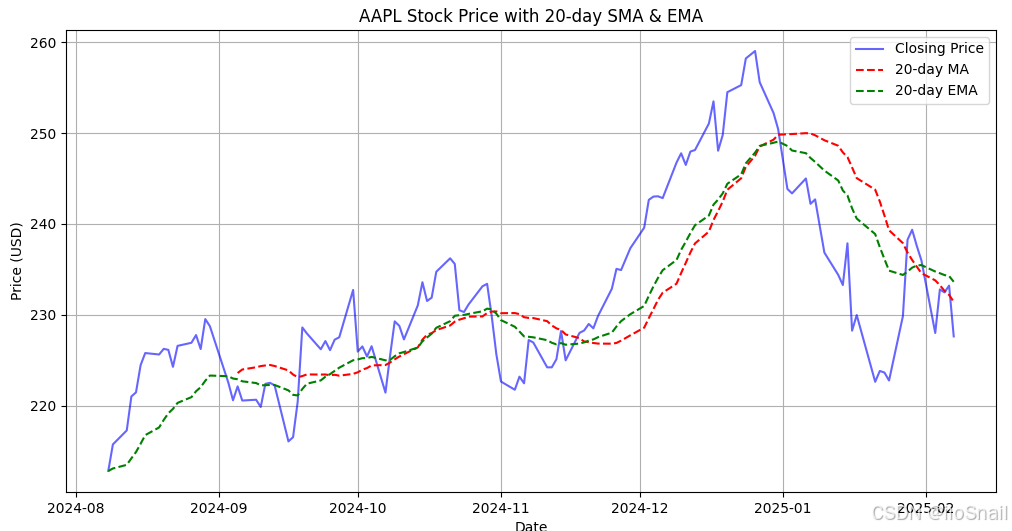
As indicated by the chart, the EMA trend is more responsive compared to the MA trend. Specifically, the EMA line declines as the stock price experiences a rapid decline around January 2025, whereas the MA line rises for several days before it eventually declines.
MACD
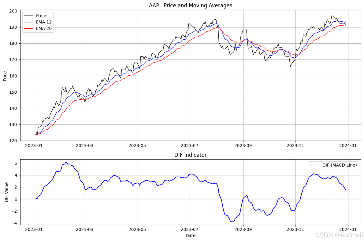
The MACD indicator consists of DIF, DEA and histogram.
DIF (Difference) Indicator
To determine the trend of a stock, we can examine the slope of the EMA curve. However, simple examining it does not clearly indicate whether a stock is experiencing an accelerating uptrend or a decelerating uptrend.
To resolve this problem, the DIF indicator is proposed. Its formula is as follows:
$$ \begin{aligned} \text{DIF} = \text{EMA}_{12} - \text{EMA}_{26} \end{aligned} $$
The DIF provides insight into trend direction:
- When DIF > 0 (Bullish Momentum) , this suggests that recent prices are rising faster than the longer-term trend, indicating a bullish trend.
- When DIF < 0 (Bearish Momentum), this suggests that recent prices are declining faster than the longer-term trend, indicating a bearish trend.
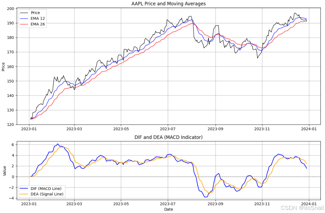
DEA (Difference Exponential Average) Indicator
Although we got the DIF indicator in the previous section, we can observe that the DIF line is not smooth. To address this issue, we can caculate the EMA of the DIF indicator to smooth it, which helps us better identify the trend of the DIF. We can assign it a new name -- Difference Exponential Average (DEA).
Thus, the formula for the DEA is as follows:
$$ \begin{aligned} \text{DEA} = \text{EMA}_9(\text{DIF}) \end{aligned} $$
By analyzing the DIF and DEA, we can derive the folloing insights:
- If DIF > DEA, the bullish trend is getting strong, or the bearish trend is getting weak.
- If DIF < DEA, the bullish trend is getting weak, or the bearish trend is getting strong.
Histogram
Previously, we learned how to assess the strength of a bullish or bearish trend by comparing the values of DIF and DEA.
To make it clearer, we can calculate the difference between them and visualize it using a histogram.
$$ \begin{aligned} \text{Histogram} = \text{DIF} - \text{DEA} \end{aligned} $$

Trading With MACD
Now that we understand all the components of MACD. Let's explore how to trade using this indicator.
DIF Crosses DEA
Buy Signals:
- DIF crosses above DEA while above the zero line: When the DIF line crosses above DEA, it indicates that the bullish trend is getting strong, which represents the stock prices might keep rising.
- DIF crosses above DEA while below the zero line: That means it is likely that the bearish trend will reverse.
Sell Signals:
- DIF crosses below DEA below the zero line: the bearish trend is gettting strong.
- DIF crosses below DEA above the zero line: the bullish trend migth be over and start a downtrend.
Zero Line Crossovers.
Buy Signal:
- Both DIF and DEA cross above zero line: Strong bullish momentum.
Sell Signal:
- Both DIF and DEA cross below zero line: Strong bearish momentum.
Divergence
Buy Signal:
- Hidden Bullish Divergence: Price makes lower lows, but MACD makes higher lows.
Sell Signal:
- Hidden Bearish Divergence: Price makes higher highs, but MACD makes lower highs
Histogram Strength
Buy Confirmation:
- Histogram bars grow taller: Bullish momentum increasing.
Sell Confirmation:
- Histogram bars grow deeper: Bearish momentum increasing.
Appendix
You can plot the final chart by the following python code:
```python
import pandas as pd
import matplotlib.pyplot as plt
import yfinance as yf

# Download historical stock data (e.g., Apple - AAPL)
symbol = "AAPL"
data = yf.download(symbol, start="2023-01-01", end="2024-01-01")

# Ensure enough data is available
if data.empty:
    print("No data available for the selected period.")
else:
    # Calculate EMAs
    data['EMA_12'] = data['Close'].ewm(span=12, adjust=False).mean()
    data['EMA_26'] = data['Close'].ewm(span=26, adjust=False).mean()

    # Calculate DIF (MACD Line)
    data['DIF'] = data['EMA_12'] - data['EMA_26']

    # Calculate DEA (Signal Line) - 9-period EMA of DIF
    data['DEA'] = data['DIF'].ewm(span=9, adjust=False).mean()

    # Calculate MACD Histogram (DIF - DEA)
    data['MACD_Histogram'] = data['DIF'] - data['DEA']

    # Drop NaN values to avoid plotting issues
    data = data.dropna()

    # Create figure with subplots
    fig, (ax1, ax2) = plt.subplots(2, 1, figsize=(12, 8), gridspec_kw={'height_ratios': [2, 1]})

    # Plot price and EMAs on the first subplot
    ax1.plot(data.index, data['Close'], label='Price', color='black', linewidth=1)
    ax1.plot(data.index, data['EMA_12'], label='EMA 12', color='blue', linewidth=1)
    ax1.plot(data.index, data['EMA_26'], label='EMA 26', color='red', linewidth=1)
    ax1.set_title(f'{symbol} Price and Moving Averages')
    ax1.set_ylabel('Price')
    ax1.legend()
    ax1.grid(True)

    # Plot DIF, DEA, and Histogram on the second subplot
    ax2.plot(data.index, data['DIF'], label='DIF (MACD Line)', color='blue', linewidth=1.5)
    ax2.plot(data.index, data['DEA'], label='DEA (Signal Line)', color='orange', linewidth=1.5)

    # Plot Histogram (Green if positive, Red if negative)
    ax2.bar(
        data.index,
        data['MACD_Histogram'],
        color=data['MACD_Histogram'].apply(lambda x: 'green' if x >= 0 else 'red'),
        label='MACD Histogram',
        width=1,  # Adjust bar width for better visibility
        alpha=0.6  # Slightly transparent
    )

    ax2.axhline(0, color='gray', linestyle='--', linewidth=1)  # Zero line
    ax2.set_title('MACD Indicator (DIF, DEA, Histogram)')
    ax2.set_xlabel('Date')
    ax2.set_ylabel('Value')
    ax2.legend()
    ax2.grid(True)

    plt.tight_layout()
    plt.show()
```


